The shift to digital has been one of the most dramatic shifts in the world of marketing and advertisement, with more and more companies setting up websites and employing digital marketing activities to boost online engagement. With websites getting developed every second, competition is only getting more vicious. To get the edge, companies are now starting to embrace responsive web design, not only in Hong Kong, but all over the world.
What Is Responsive Web Design?
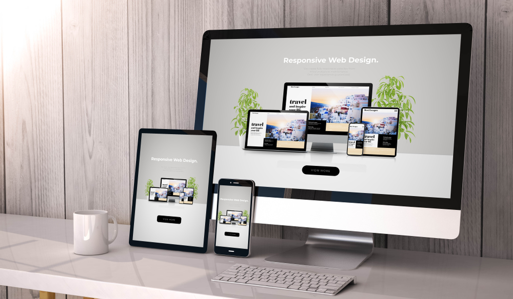
Responsive web design is an approach specifically developed to make elements of a website accessible through any device, any resolution, and any orientation. Instead of designing pages for individual devices with their own specifications, responsive web design employs a simpler process where all website elements adjust accordingly to a user’s browsing habit, be it the images, buttons, or the navigation menu. The consistent look of websites also helps brands preserve the feel for all users on any device. Aside from these, it is also beneficial for different site metrics.
Here are some responsive web design advantages you’ll be able to enjoy:

Boost Mobile Traffic
Mobile users are specifically fussy when it comes to site organization and adaptability. In Hong Kong, having a responsive web design is especially important since it has one of the highest mobile penetration rates in Asia – coming at about 80%. This means that today most interactions are happening through mobile, which have varying device specifications and resolutions. By allowing your site to be viewable and readable on a mobile device, you can easily capture the attention of mobile users compared to brands that do not use a responsive web design.
More importantly, Google recognizes the rising number of mobile users around the world by employing mobile-first indexing. Google crawls and indexes pages through mobile site versions. This can largely affect your search engine ranking if your content on the mobile site is different, if you don’t have an optimized mobile site, or your main site cannot adjust to mobile devices. With responsive web design, you can ensure that your website will have identical content with that of your desktop site, which will make sure that crawlers will be able to index your site in its entirety.
Faster Loading Speed
Load speed is a big contributor to user experience, with almost half of the population choosing to leave websites if they don’t load within five seconds. One possible reason is that load speeds mimic a thought process for users. Anything that blocks this thought process will not be worth their time, which will cause high bounce rates in users. This may affect a site’s credibility, causing the eventual drop in search engine ranking.
With an optimal page load time of 1 to 2 seconds, site owners are now using all possible strategies to speed up loading time, including responsive web design. Responsive web design improves loading speeds by allowing website elements to adapt to different devices, removing the need to load unnecessarily large images and elements for smaller screens.
Higher Conversion Rate
Good web design and accessibility encourage users to stay longer on your website. They get to interact more and navigate better with a mobile-friendly site, raising the possibility of conversion to about 67%. When you employ competitive web design, you’re also promoting site credibility, with users often equating a brand’s trustworthiness through their website’s appearance. The more credible your brand becomes, the higher conversion rates you’ll get.
Improved User Experience
With responsive web design’s fluidity, users can access and enjoy the features of websites on any device seamlessly. Today, more and more people browse the internet on multiple devices. You want your users to have the same experience on whatever medium they choose.
Easier Site Maintenance
Before the introduction of responsive web design, developers needed to manually create website versions for different devices to accommodate the differences in resolution. When an element needed to be changed, all other website versions needed to be edited as well. This process is simplified with responsive web design since you’ll only be working with a single page.
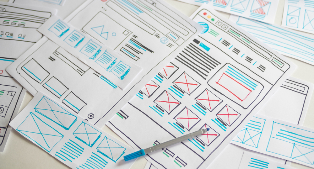
Elements of Effective Responsive Web Design
To say a website is truly responsive, it doesn’t stop at resolution adjustment for each device, but every element must respond to the user’s preferences. You can’t say a website design is responsive without three crucial features:

Flexible Grid Foundations
One of the primary characteristics of a responsive web design is the ability of columns to readjust and rearrange themselves depending on the size of the screen. It wouldn’t matter if a user prefers to browse on their smartphones or they want to switch to a desktop for a bigger view. The user experience will still be the same, albeit in a more appropriate organization.
This is also especially important for mobile users, where responsive web design adjusts a site’s size so users wouldn’t need to scroll in different directions – only the up and down motion. Mobile users have shorter attention spans, which means that if they don’t see the information they’re looking for at first glance or at least at the first scroll, there’s a high chance that they will bounce.
Optimized Images
Images have a higher retention rate than content, which is one of the reasons why some websites go the image-heavy route. However, this can become complicated when images aren’t optimized or responsive. Not only will your site appear messy when images overlap with their containers, it may also slow down page load speed. With responsive web design, images resize themselves automatically with the containers they’re enclosed in.
Media Queries
Media queries may be the backbone of responsive website design, where pages change according to a browser’s conditions, like screen resolution, orientation, and media type. Instead of targeting multiple resolutions through different codes, media queries allow pages to load, rearrange and resize elements to make them more appropriate for different users on different devices.

Responsive Web Design Examples to Take a Cue From
If you’re still not quite sure how this works, here are a few examples of websites that use responsive web design. Note how these websites respond accordingly with browser resizes and device switches and how the fonts, images, and menus react accordingly in real-time.
Manulife Hong Kong
Manulife Hong Kong has a highly interactive website, wherein users can easily navigate the site using menus, buttons, and image-heavy thumbnails. Employing a responsive web design is especially crucial for websites like this since the images and buttons may become skewed or disorganized.
AXA Hong Kong
When you visit AXA Hong Kong’s website, you’ll find that their site largely features content-heavy pages, with navigational buttons that help you easily find the products you’re looking for. With a responsive web design, AXA ensures that mobile users can access the buttons through thumb taps on their smartphones by automatically adjusting button sizes for smaller browsers.
YouTube
When you log onto YouTube, you’ll notice how the different elements of the website are strategically located in accessible points on the page, from the side menu to the search bar at the top. When you try to resize the browser, YouTube’s components get rearranged to improve navigation – the menu transforms into smaller buttons, while the video thumbnails become bigger, making them easier to click on if you’re scrolling through mobile.
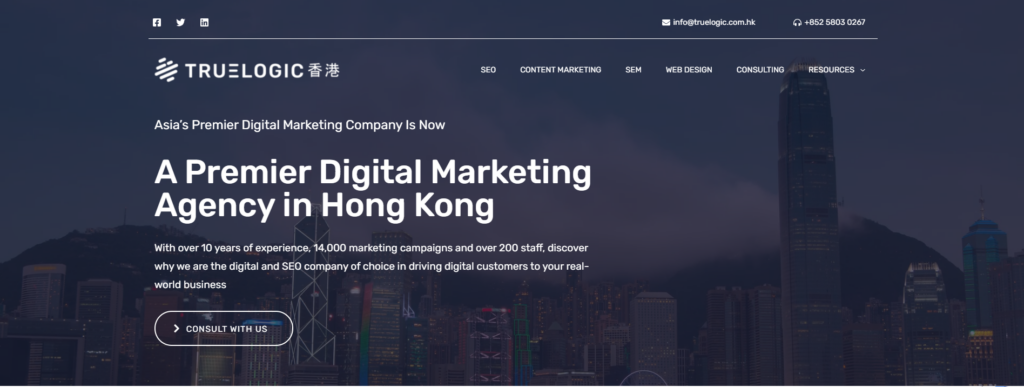
Truelogic
As a digital marketing agency that believes in the importance of responsive web design, Truelogic also employs it on our webpage. Our desktop homepage is content-heavy, with long web copies in multiple columns to organize thought and allow for easy skimming for users. However, multiple columns wouldn’t work for mobile users since the text would either become too narrow or too awkward to read. This is where responsive web design helps: rearranging components and sections in a website based on a user’s preferences, thus improving readability and user interaction.
Embrace Responsive Web Design, and Improve Your Brand’s Standing
In the digital world, your website functions as your first introduction to users in Hong Kong and around the world. It influences your credibility, your conversion rates, and the overall success of your brand. However, with the rising number of devices that are used to browse the internet, developing your website has become much more complicated. Fortunately, responsive web design offers an easy solution, wherein you can improve readability, increase performance, and help users gain a better user experience through adaptability.
As a proponent of responsive web design, Truelogic knows how to combine strategy, visuals, and user-friendliness for a memorable online experience for all users. With our web design services, we make sure that websites express your brand’s identity through personalized content and modern features specifically tailored to your preferences,
If you have any questions or queries about employing a responsive web design for your website, feel free to reach out to us here.