Website design largely dictates user experience, retention, and lasting impressions. This is why a lot of companies and brands put an extreme amount of focus on building websites with faster load speeds, great navigation, and organized content structures. However, while a lot of web designers and web developers are familiar with the best practices in website development, some problems and issues may slip through the cracks. While some web design issues are easy to overlook, some may cause significant loss in audience interaction and translate to a poor experience.
In this article, we will discuss the most common website design mistakes and issues that you may be committing or overlooking. Continue reading to learn how you can improve your website design for your Hong Kong brand and in turn get better first impressions and improved conversion rates.

10 Website Design Issues You Might Be Suffering From
Web design largely depends on your preferences, your brand’s identity, and the overall experience you want your users to have every time they visit your website. Having a unique and well-functioning website with the best features will not only leave a lasting impression on your target audience, but it’ll also keep you top of mind for your audience. However, without proper execution, you might fall victim to some of the most common web design issues often seen online. Here are the top 10 that you should look out for:

No Call-to-Action
For every website there is on the web, there’s always an end-goal for the site owners – whether it’s for purchases through their shop or sign-ups to their service. A call-to-action basically works as a push for your audience to let them know the next step they can take. This is why a lot of websites put eye-catching call-to-action buttons to effectively direct their readers to the task that the site owners want them to accomplish before leaving the website.
However, a lot of websites forget or overlook the need for call-to-actions, letting their readers leave their website without encouraging them to become real customers or clients. To solve this common website design issue, create a clear and engaging call-to-action for your website using strong command verbs that leave nothing up for confusion. Put your call-to-action button somewhere your readers can easily access and click regardless of what device they’re browsing on.
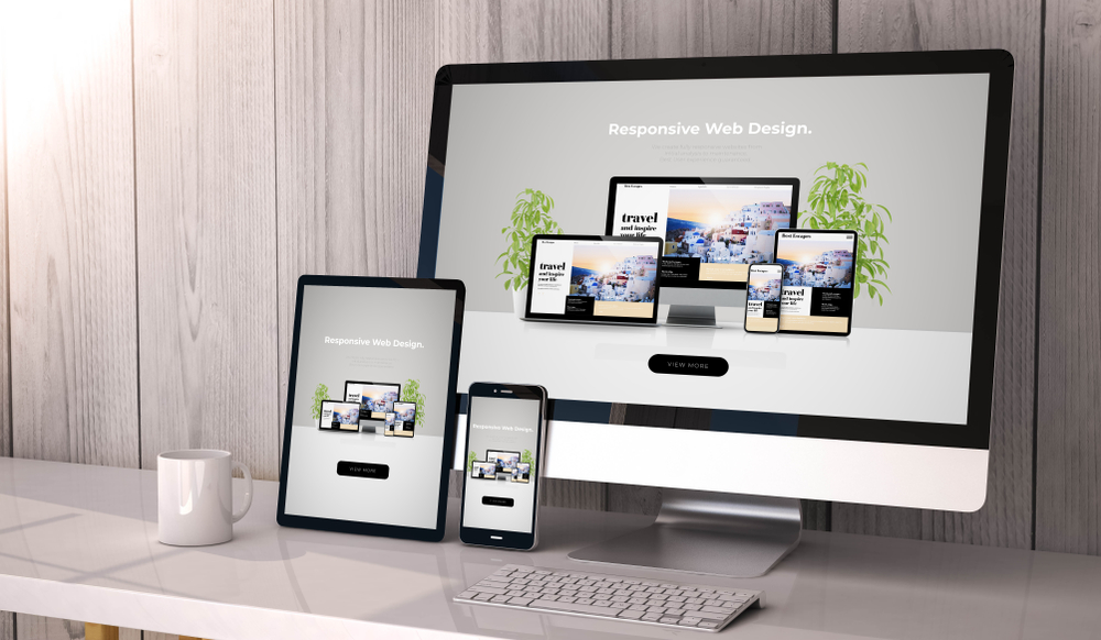
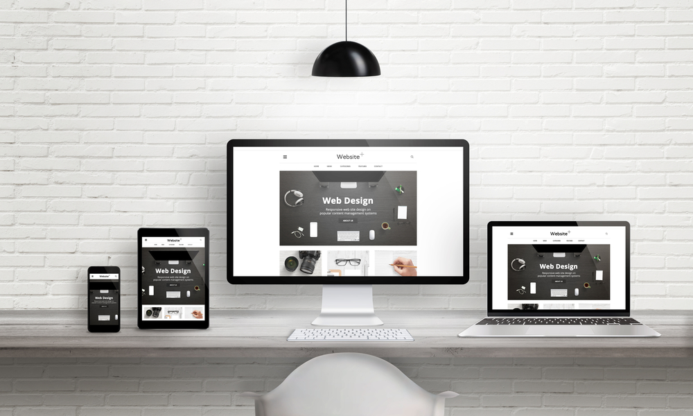
No Responsive Design
Search engines today put a lot of importance on a website’s mobile-friendliness since a significant number of searchers now access search engines through phones and other mobile devices. In fact, mobile-friendliness is now looked at as a crucial part of ranking. Unfortunately, some websites today still build their websites solely for desktop viewing, making mobile accessibility almost impossible with awkward placements of site elements when viewed on a mobile screen. Not only does this impede on user experience, but it also causes a lot of customers and readers to bounce.
To resolve this website design issue, have your web designers and developers create a responsive website that automatically adjusts the elements depending on the screen resolution where the website is being viewed from. This offers your target audience an optimized browsing experience, as well as better accessibility for your site’s features.

Hidden Navigation
You might think that hiding your navigation may make your site look more streamlined, but it actually makes user navigation harder. As website designers, we typically know how to effortlessly navigate through a website we’ve designed. While it might be easy for us, the same cannot be said for new site visitors, especially when crucial buttons and navigation menus are not visible on the screen.
While it is commonplace in mobile sites to maximize the use of screen space, it’s not a recommended practice on desktop sites and may even be seen as a web design issue. Instead of hiding your navigation, consider optimizing your dropdown menus to help your readers better interact with your site.

Lacking Color Contrast Between Text and Background
Ensuring the readability of your website doesn’t only fall on your content’s position on the page – It’s also dictated by the font color. One common web design issue is using colors that are too close to each other, making reading a hassle for everyone visiting your website.
A great practice to always keep in mind when choosing text color is to ensure that there’s enough difference between your background color and the font color. If you’re dealing with a darker background, always stick with a font color that’s lighter, and vice versa. As much as possible, avoid using loud colors that are not that easy on the eyes since readers won’t stick around if they think that your font color is too straining.

Too Many Font Styles
Font style is also an important aspect you need to consider when building a website. Using too many clashing font styles will not only make your website harder to read, but it will also make it look cluttered and disorganized. As much as you want to use fun fonts, it’s best that you stick to a maximum of three different font styles, specifically on your headlines, your body, and the navigational menu.
If you want to use a unique – but still readable – font style, you can do so with your headlines since they typically get larger spaces on web pages. For your body, it’s best to stick with a plain sans serif font to maximize readability. As for the navigational menu, go for a font style that mixes well with the other styles you’ve chosen – something that’s a bit decorative but is still easy to read.
Crowded Websites
One common web design problem that we’ve all probably seen is overcrowding, where every website element is cramped into a small space, making scan-throughs a nightmare. If you’re a website owner, this is probably one of the worse mistakes you can make since you’ll be overwhelming your readers with the content that you’re bombarding them with at first glance. As much as possible, utilize white space for better aesthetics and improved division between your website’s elements.
Lack of Accessible Contact Information
While your website functions as your online identity, you’d still want your target audience to know how they can reach you in the physical world, whether through your address or through your mobile number. One common website design issue that a lot of websites have is the lack of a contact form or updated contact info where your readers can reach you if ever, they have questions or queries about your service or your products.
Solve this by making sure that all the information you put on your website is up-to-date and that you designate a specific area where your readers can find your contact info.
Use of Blurred or Low-Quality Website Images
A good first impression is what you’re aiming for every time a new user clicks on your website, and this is a very hard task to do when you’re using low-quality images on your homepage or anywhere else. Readers and customers don’t want to suffer through scanning blurred images of products and services that you’re pushing them to purchase or sign up for. To resolve this website design issue and to achieve better aesthetics and overall user experience, stick with images that are clear, high-quality, and can perfectly encapsulate what your brand is about.

Lack of Proper Search Engine Optimization
Creating and building a beautiful and high-quality website might be top of mind when it comes to boosting your online presence. However, without proper search engine optimization, your website is basically undiscoverable on search engines. To correct this web design issue and ensure that you can reach and connect with your audience and your potential customers, consider improving your website’s content to better target relevant keywords, employ SEO strategies, and consider partnering with an experienced digital marketing consulting agency for your Hong Kong brand.
Slow Site Load Speed
Did you know that if your website takes more than 5 seconds to load, there’s a 90% chance that your reader will bounce? Slow site loading speed is a common web design issue that is influenced by various factors, from internet speed, plug-ins, and image loading. While your readers’ internet is out of your control, you can easily optimize your site’s speed by going for better hosting solutions, optimizing your images, and removing unnecessary plug-ins. Remember that the optimal site load speed is under 2 seconds, so that’s what you should be aiming for.
Improve Your User Experience, Get Higher Revenue and Customer Loyalty
Web design is a crucial part of your brand’s authority and trustworthiness. This is why brands all over the world create websites specifically designed to cater to their target audience’s needs. However, it’s hard to make websites immune to web design issues. This is why we’ve dedicated ourselves to providing you with articles that can aid you in navigating the digital world, from articles about “What is UX Design?” to guides on how you can build your business with SEO. Continue reading our articles on Truelogic HK and continue building your digital marketing arsenal with us.